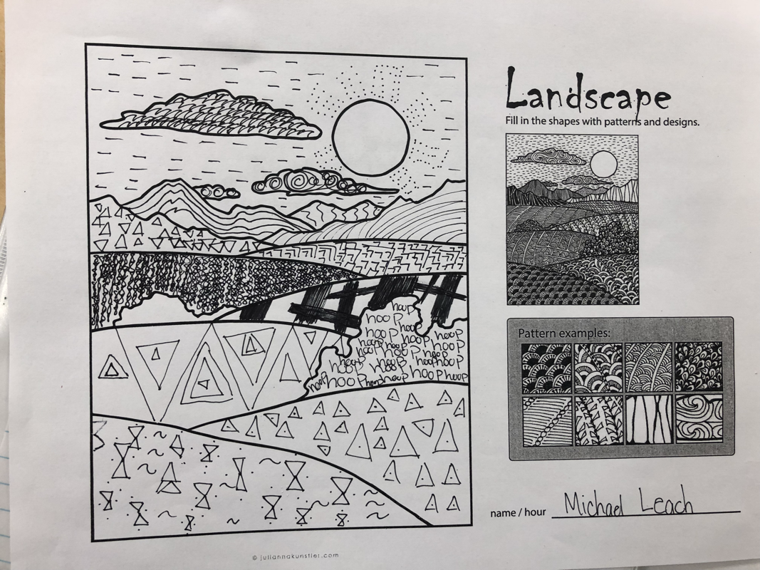
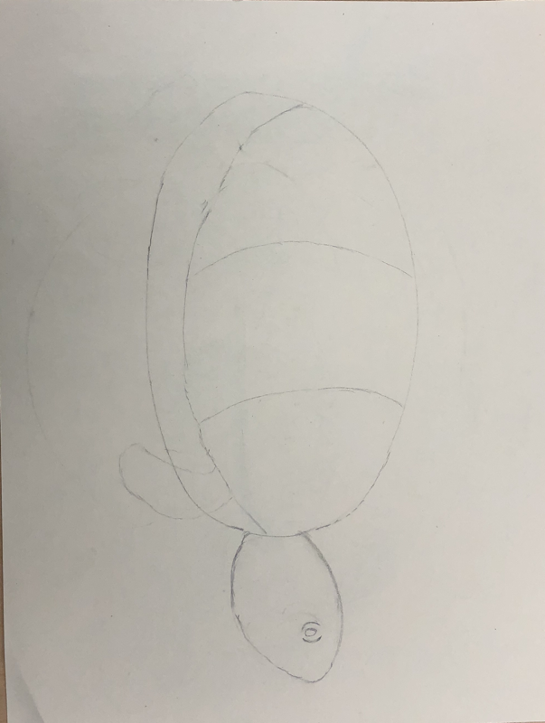
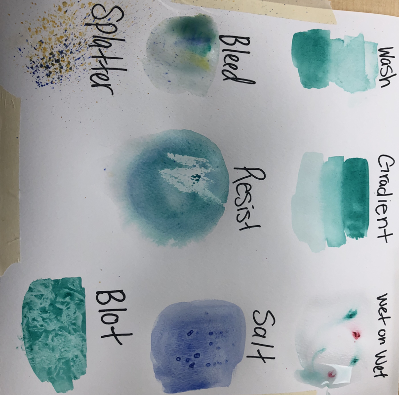
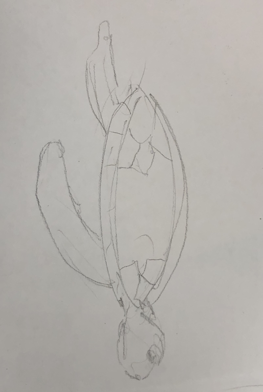
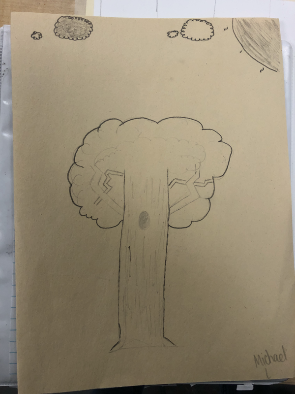
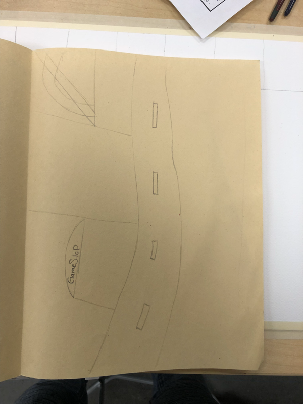
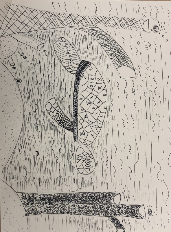
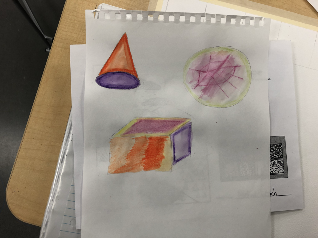
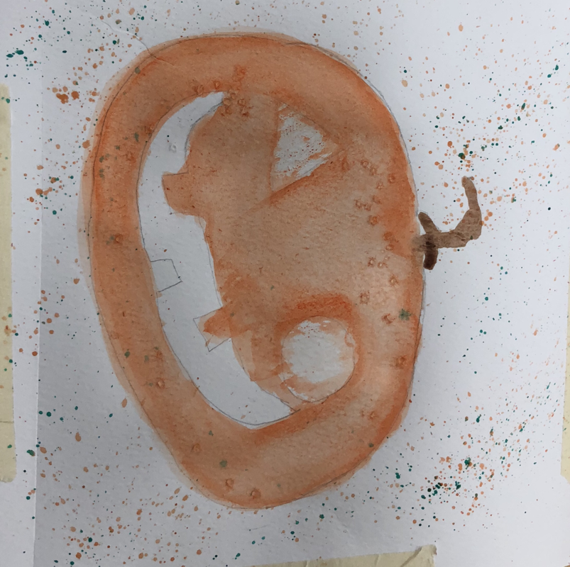
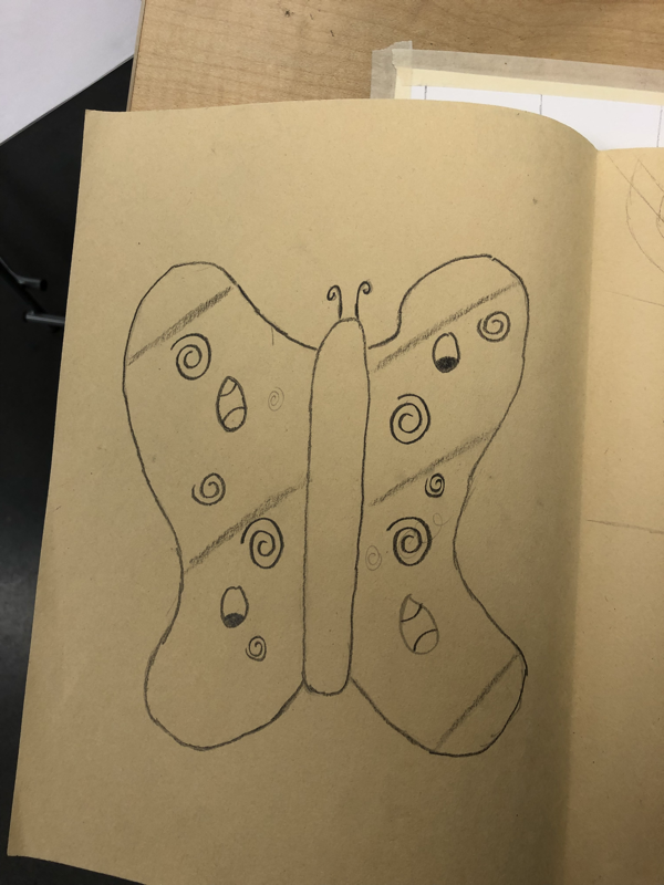
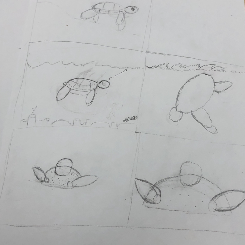
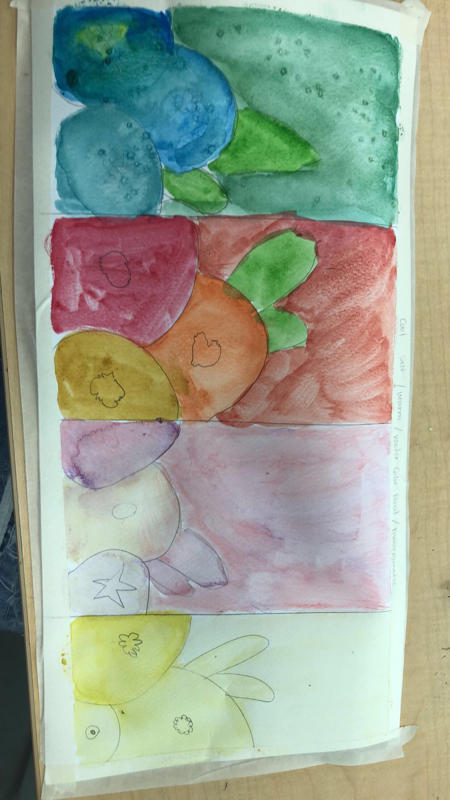
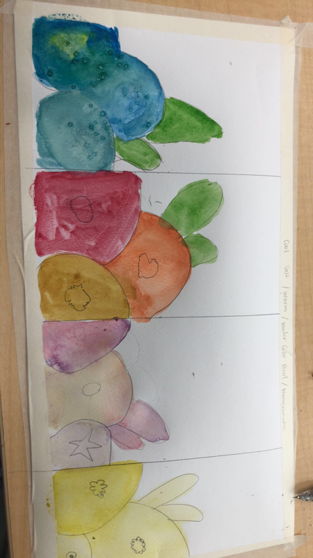
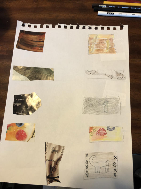
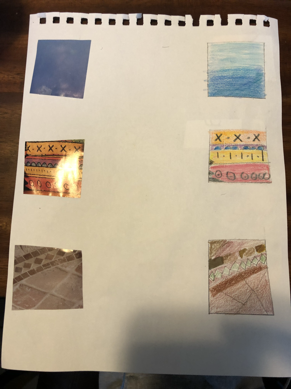
Pen& Ink Techniques , Water Color Techniques, Sketches, Patterns1. My first picture is a bunch of different patterns different sections of the mountains and sky. 2 This sketch is the beginning of my turtle sketch. 3 different types of watercolor techniques. 4 this is my assessment drawing of my tree. 5 is incomplete but i was gonna have a road in the middle of a strip mall. 6 this is my final turle project i used stippling and hatching. 7 my different shapes and shadows on them.8 my watercolor pumpkin where i used the salt technique. 9 This is my butterfly assessment that goes with my tree where i used different patterns on the wings. 10 Multiple sketches before my final turtle i had to choose the potion of the turtle. 11 this is another sketch of my turtle my teacher showed me.
|
|

WaterColor Project
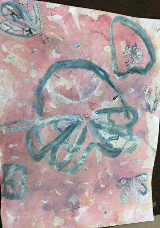
Explain the process you had to use to create the poured watercolor painting. I wanted to use the masking fluid to keep the spots that i wanted and the rest used for different colors.
4.What would you do differently if you were to do this project again? I would change my designs in the wings of the dragon fly and add more yellow.
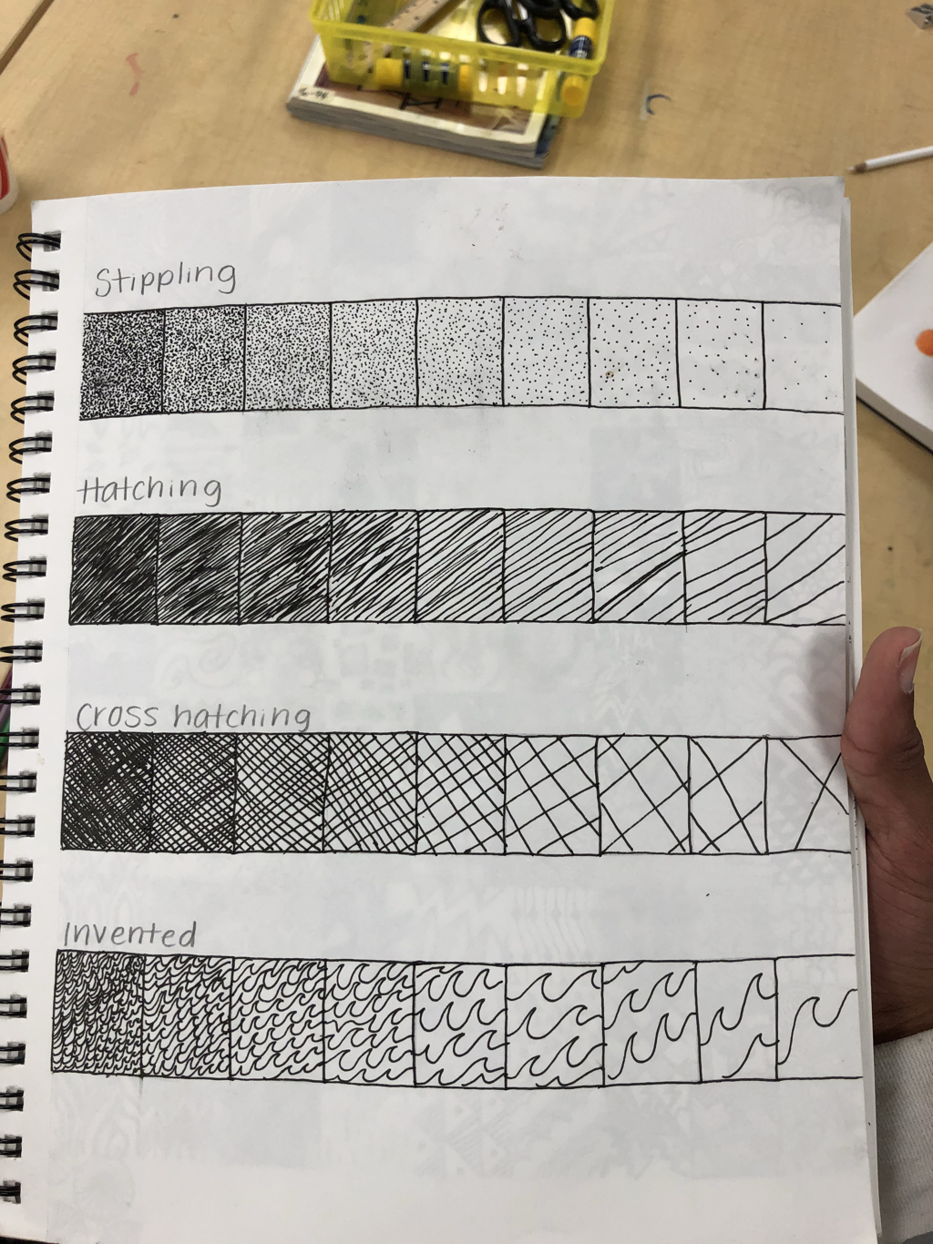
5.How did you use layers, textures, and color to create a successful piece? I couldn't layer as well as i wanted too but the different layers gives it a different look.
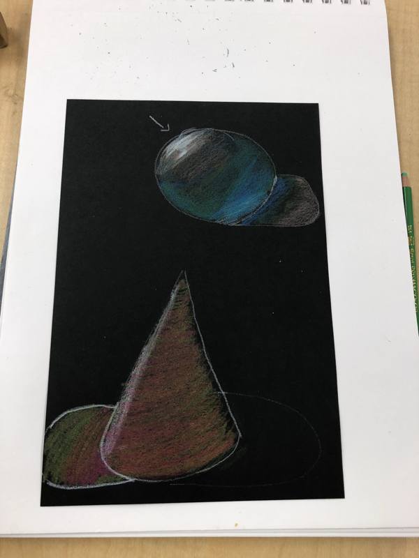
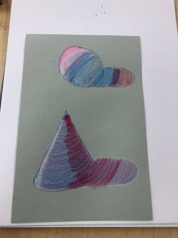
6.Do you feel that the mini watercolor lessons were beneficial to you learning more about watercolor? Explain. They were definitely helpful it helps you plan what you wanna do and how you want do them for your final project and just getting a better understanding.
7. Was having a guest artist a positive experience? Explain. Yes it was it helped picture how good its suppose to look. He was also very hands on and helpful.
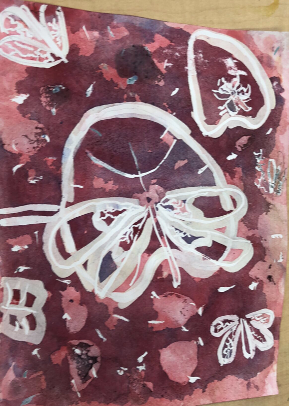
8.What did you learn from the guest artist that gave you more insight into being a professional artist? I have no drive to be a professional artist but him showing us different ways to layer and color was very cool.
- Describe any difficulties you had with this process. I had difficulties getting different vibrate colors in certain areas and spacing.
4.What would you do differently if you were to do this project again? I would change my designs in the wings of the dragon fly and add more yellow.
5.How did you use layers, textures, and color to create a successful piece? I couldn't layer as well as i wanted too but the different layers gives it a different look.
6.Do you feel that the mini watercolor lessons were beneficial to you learning more about watercolor? Explain. They were definitely helpful it helps you plan what you wanna do and how you want do them for your final project and just getting a better understanding.
7. Was having a guest artist a positive experience? Explain. Yes it was it helped picture how good its suppose to look. He was also very hands on and helpful.
8.What did you learn from the guest artist that gave you more insight into being a professional artist? I have no drive to be a professional artist but him showing us different ways to layer and color was very cool.
I️ used diffrent water color techniques to give it a diffrent look
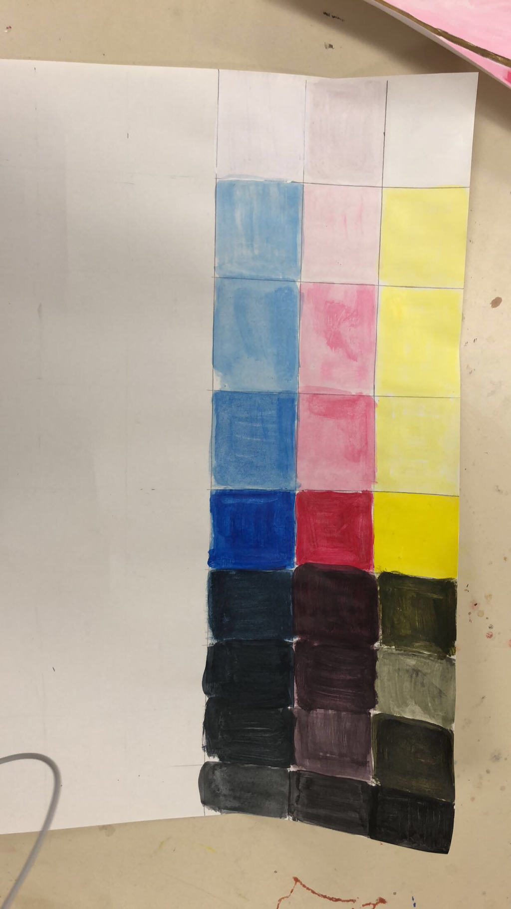
1. This project was very long and after the first row or two I started to get lazy and mixing my boxes and not going one by one so my craftsmenship is not as well as it should be.
2. I couldn’t not get the light tan looking color no matter how many times I layered I think it’s because I colored to hard.
3. I did for the first couple or rows then I got lazy towards the bottom where u can tell a difference in the color.
4. I did not accomplish this part in my project I tried to but I colored to hard I think.
5. Depending on what color you wanted to keep layering the color to get what you want lightest color always was first then darker.
6. I could redo the part where I didn’t go box by box.
7. I feel like I was ready but wasn’t patient enough.
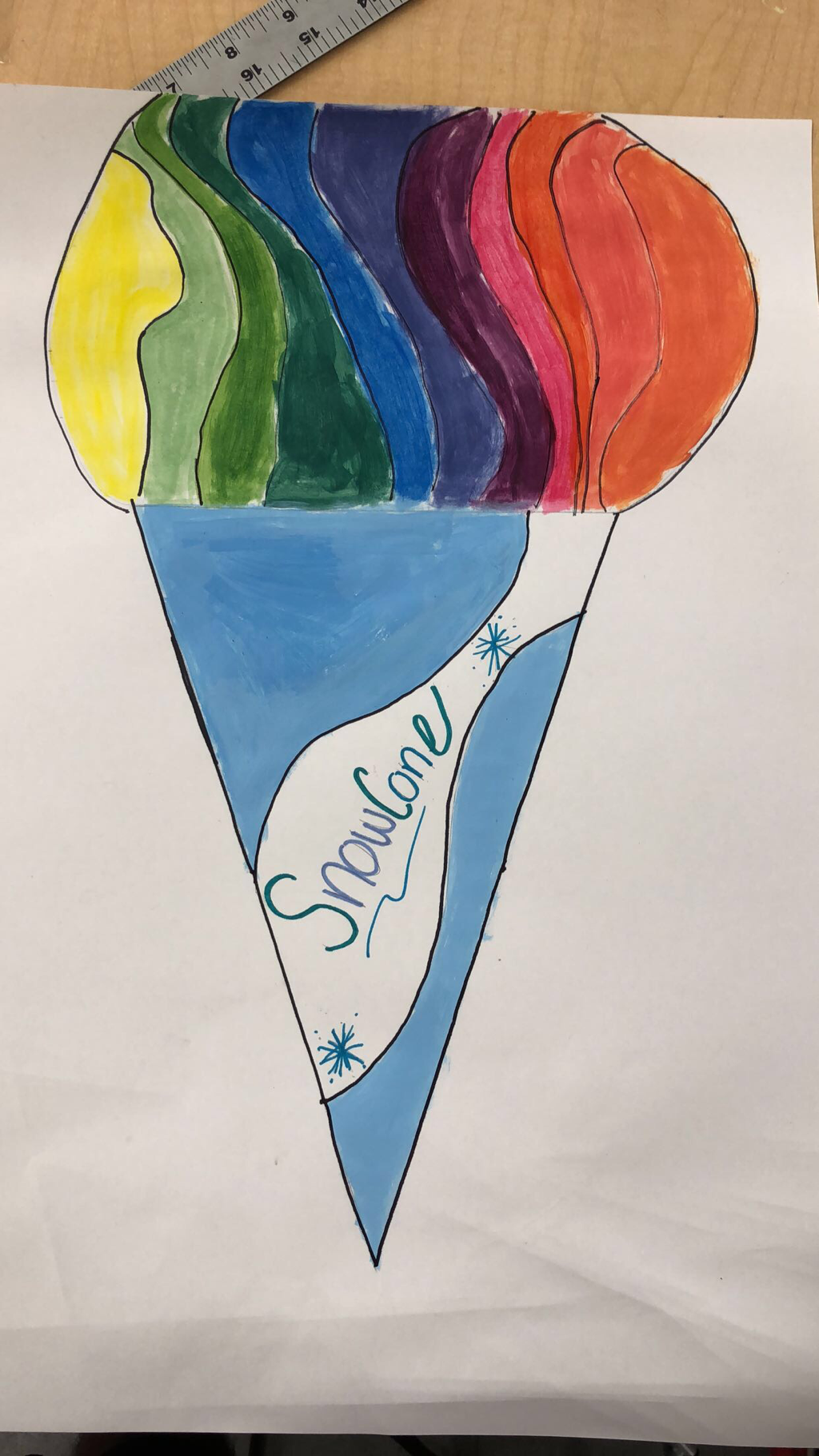
1 For this mini project I decided to do a snow cone to display the different colors and shades. The different colors represent different flavors.
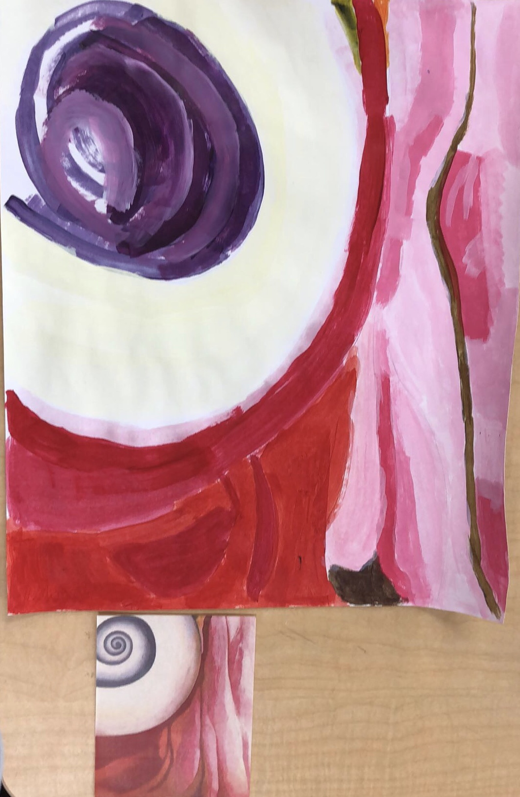
In this piece I had to draw what I saw in the picture the swirl was the most difficult for me and blending the purple and white
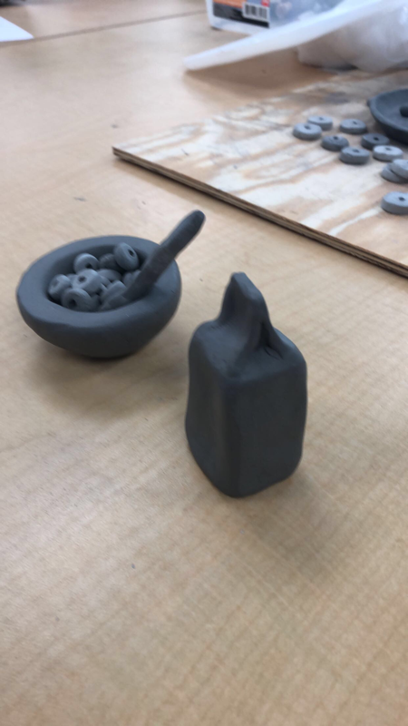
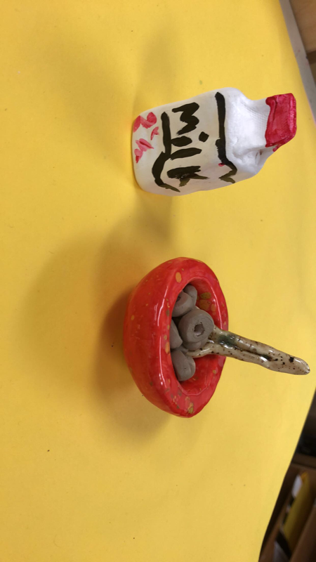
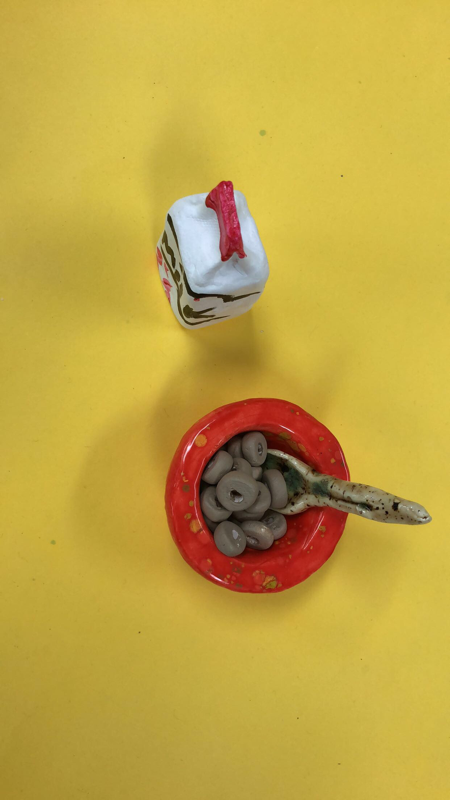
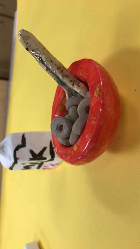
1.My bowl was well executed along with my Cheerios but my spoon I could have use more time and effort.
2. The most difficult part for me was making sure everything was smooth and even and I still struggled with that.
3. My bowl and spoon did but my Cheerios did not I couldn’t get that tan color for Cheerios so they came out grey.
4. I think my project was interesting because mine was the only one of that size and the colors I chose went well with each other.
5. Doing something in 3D gives it a different perspective and thought processes of how you want to design it.
6. I didn’t have to many textures besides on my Cheerios and I used a small sponge to get the texture.
7. I would say it looks a little similar but it defiantly would have look better if I did it actuall size.
8. I would make my project bigger and also add more texture to my items.
|
|
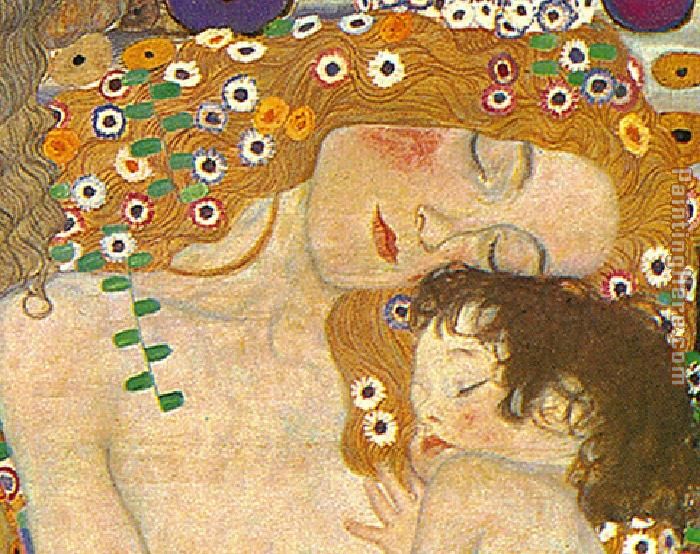
Gustav Klimt is an Australian symbolist painter during the “Golden Period”and one of the most prominent members of the Vienna Secession. His primary art was the female body. He painted portrait, landscapes. Klimt was influenced mostly by Japanese art. Klimt became one of the founding members and president of the Wiener Sezession (Vienna Secession) in 1897 and of the group's periodical Ver Sacrum (Sacred Spring). One of his more famous paintings are “The Kiss” which is two lovers kissing on the edge of a flower bed this is a central piece in the Vienna Secession art movement. Early in his artistic career, he was a successful painter of architectural decorations in a conventional manner. As he developed a more personal style, his work was the subject of controversy that culminated when the paintings he completed around 1900 where it was criticized as pornography.
When he was just 14 Gustav Klimt stop attending to be enrolled in the Vienna School of Arts and Crafts where he received training as an architectural painter until 1883 (His brother Ernst, also an engraver, enrolled in the same school in 1877). Klimt's artistic abilities were recognized by his teachers and Klimt was encouraged to keep thriving with his talent of being an artist develop them. He was so talented he began to earn a small amount of money for his artwork while still being in school. Klimt was one of the most important founders of the Vienna Secession in 1897, and served as its initial president, though he was chosen less for his completed oeuvre - relatively small at that point - than his youthful personality and willingness to challenge authority. |
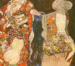
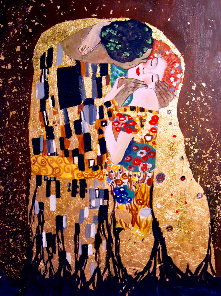
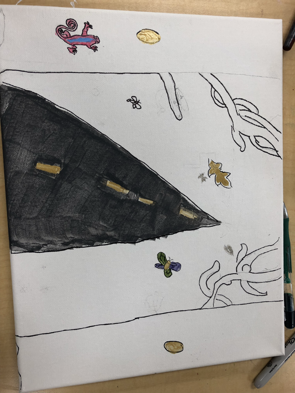
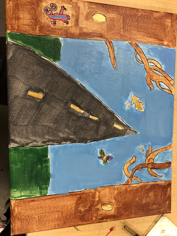
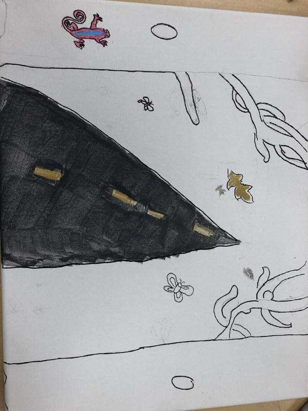
1. My artist was Gustav Klimpt and Alexander . Most ideas were based around golden leaf and streaks in his art.
2. I think my art was as neat as I could make it personally it was one of my best art pieces I’ve done.
3. The most difficult part was making the trail look like it was disappearing in the distance.
4. My color choices was golden for leaves and animals. And using the color blue and green .
5. I incorporated the golden streaks and leaves to go with Gustav Klmipt.
6. To make it more neat and to make more golden streaks. And more hills.
7. I would make it bigger add more hills and golden streaks and make things neater.
Final Reflection Art 2
This Semester i did not enjoy at first but as the class went on and we started to do different things as far as painting and water color I got more involved. And asked more questions and started to enjoy myself and learning the different water color styles. I enjoyed the painting units the most. And also the sculpting even though I struggled to come up with ideas. I did not enjoy the drawing units but that’s because that’s by far my weakest area. But you helped me through it and a appreciate it. And I’m sorry for being late everyday I know it irritated you.
